Hi,
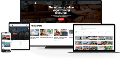
Thanks to the computer skills of my friend Jeff, the creative minds of myself and most of my friends, and my ability to do handstands, the new site is up and ready. Take a look around, and make sure to leave some comments if you find it appropriate.
Cheers,
Dean

Your new site looks great. Easy to use and everything in one place. Sort of like one stop shopping. Great job.
Thanks John!
I prefer the old site. I know the importance of responsive sites these days, but my first impression of this design is just that it’s all over the place and very busy…I don’t know where to look. It does get better to read when I narrow my browser window, though. On the old site I just wished you had made that big black background which nearly totally obscures that great photo of Dean less opaque so I could see the photo and the page would make more visual sense (or narrowed the black background or chose a different photo). How come I can see the same post in both the old and new formats…depending on which email link I click? (same post, different originating emails)
Paul
Hey Paul – thanks for your feedback. Unfortunately, the old side was a little too basic and it didn’t clearly display all the different things that I offer. This one helps visitors know about all the things that I offer. I made the menu as easy to follow as possible, and I think that with time you will adjust to the new website. You have to keep moving forward, or you’re moving backward! I needed to take the website to the next level.